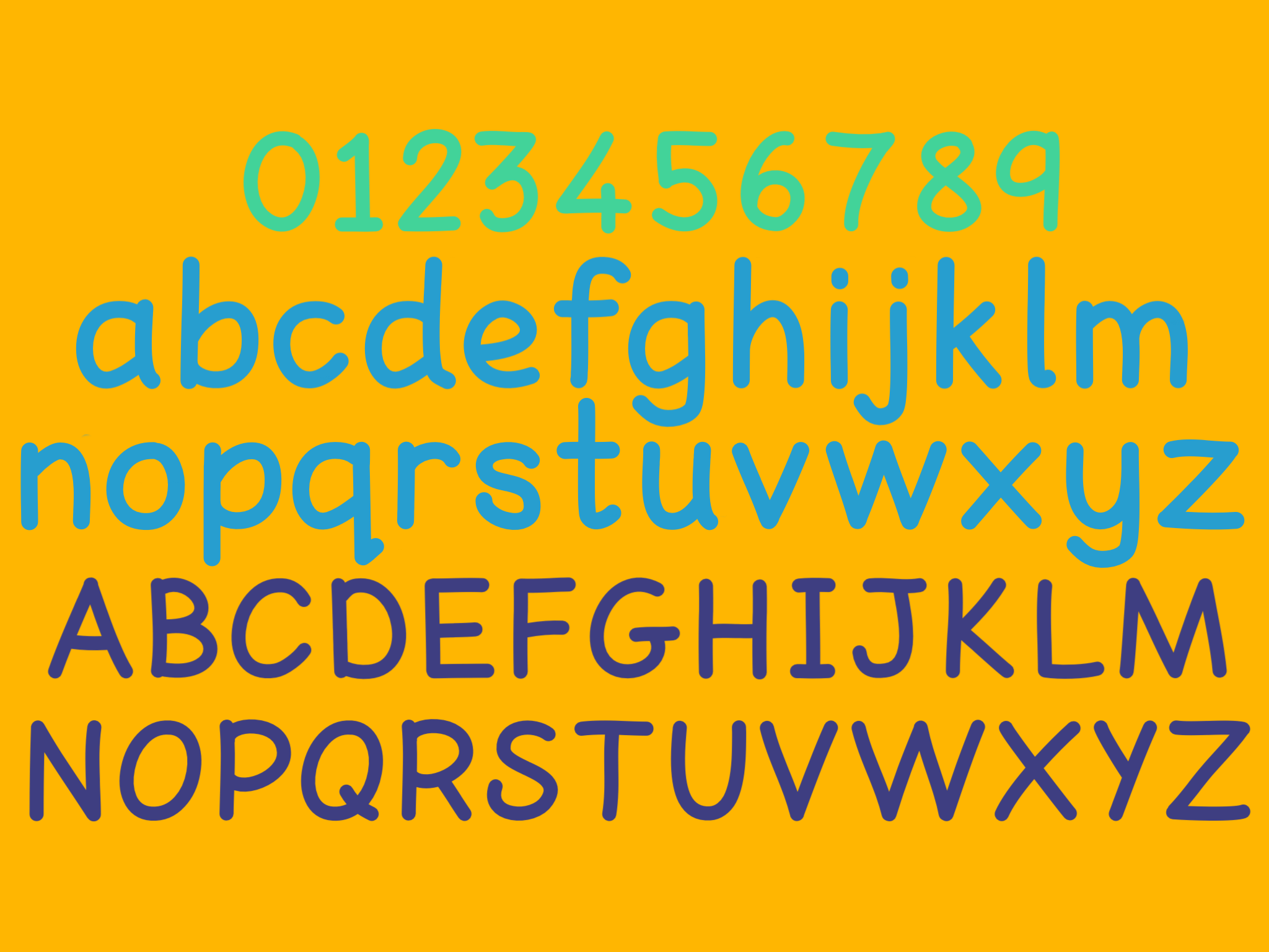
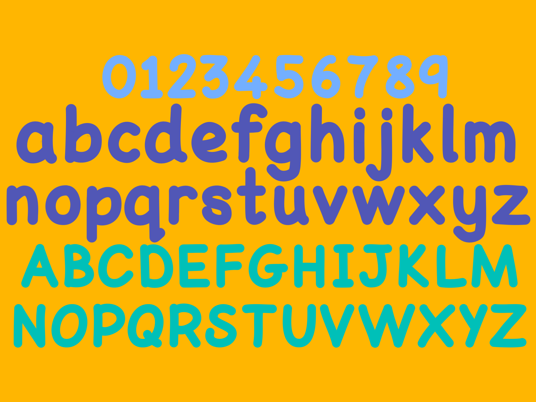
This font is under a 'creative commons' license.
You are free to:
Share — copy and redistribute the material in any medium or format
Adapt — remix, transform, and build upon the material
The licensor cannot revoke these freedoms as long as you follow the license terms.
Under the following terms:
Attribution — You must give appropriate credit, provide a link to the license, and indicate if changes were made. You may do so in any reasonable manner, but not in any way that suggests the licensor endorses you or your use.
NonCommercial — You may not use the material for commercial purposes without permission.
The search for a perfect font
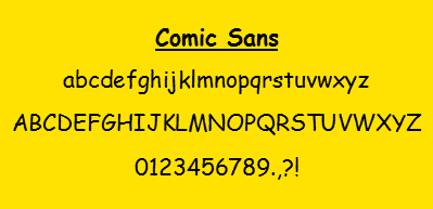
I did not set out to create my own ‘dyslexia friendly font’. I began, as most teachers do, with ‘comic sans’, but grew frustrated with the reversibility of letters and the difference between ‘comic sans’ and handwriting - the ‘q’ missing it’s flick, the ‘l’ and ‘t’ without tails.
Arial was better for older children, but was stuck with an instroke ‘a’, and letter reversals remained problematic for children with dyslexia. It is crowded and I had to constantly increase the ’tracking’ between letters to increase legibility.
So I started exploring what makes a good font and what alternatives are out there.
The British Dyslexia Association reports that designers found dyslexic readers liked:
- Good ascenders and descenders, b, d, f, h, k, l, t, and all capitals; g, j, p, q, y.
- b and d; p and q distinguished, not mirror images.
- Different forms for capital I, lowercase l and digit 1.
- Rounded g as in handwriting. Most liked rounded a, although perhaps some felt that it may be confused with o.
- Letter-spacing, e.g. r, n together rn should not look like m, (‘modern’ may scan as, or sound like, ‘modem’.)
This information is from https://bdatech.org/what-technology/typefaces-for-dyslexia/. Other sites suggest broadly similar guidance. See http://www.altformat.org/index.asp?pid=344, https://www.dyslexic.com/fonts/.
Environmental Print
Environmental print is a huge part of children’s learning to read but is also part of learning to write. Classrooms include ‘word walls’ and have ‘alphabet friezes’. Bookmarks include ‘tricky words’ and ‘topic word mats’ are on tables for children to refer to while writing as well as while reading. For most children learning to read and write are integrated processes. I wanted a font that was unobtrusive enough to use in any learning environment.
Writing - provide a clear model
As a primary school teacher I have noticed how precise children can be when copying words. If a ‘w’ is rounded in print it is likely to be rounded when copied. And if a child comes across an unfamiliar letter formation it can really throw them (think ‘a’ and ‘g’ letter formations). Children also tune into the ‘cues’ letters provide- 'q' has a ‘flick’ and when it doesn’t that is confusing. I wanted to create a font which included the most familiar letter formations.
Handwriting - the number of ’strokes’ learned
However, I added what is for me another major consideration. I wanted to create a font that could be used to support children's handwriting. In particular I wanted to reduce motor memory and memory load by reducing the number of different ‘strokes’ a child had to learn. For children with dysgraphia or dyspraxia a simple font with repeated strokes is supportive. But even for children without motor-skills issues, the less thought that goes into letter formation the more thought can go into writing content.
Why not use one of the Dyslexia Fonts that already exists?
I create resources for students with dyslexia every day. I want my resources to be optimally designed and I cannot get that in a ‘free’ font as none fulfill all the guidelines. The dyslexia friendly fonts that already exist are incompatible with the 'early intervention' work I do. Many of the children I teach are learning handwriting and early reading skills at the same time. For instance ‘Dyslexie Font’ and ‘Open Dyslexic”, both use a letter ‘a’ formation not usually taught in handwriting and ‘Lexie Readable’ has an unclosed 'b' and 'p' formation that could confuse children who are learning letter formation.
Dyslexie Font
Open dyslexic
lexieReadable
The Dyslexic Logic Font
Provides good letter spacing and avoids ‘blur’ between letter combinations.
The space between individual letter pairs (kerning) has been increased to reduce the blur between problematic pairs. The space between letters in general (tracking) is slightly wider to reduce crowding. In addition to space between individual words is wider to make scanning text easier.
Ensures clear distinctions between letters that can be confused.
This font ensures that capital letters, lower case letters and numbers can be clearly distinguished from one another.
Avoids mirror images.
The distinction between letter formations means that letters cannot be reversed or flipped to form other letters.
Provides clear ascenders and descenders.
Ascenders have been standardised so that letters like 'f' and 't' are the same height as other ascenders. Both ascenders and decenders are extended so they are clearly visible and distinct.
Uses rounded ‘a’ and ‘g’.
The letter 'a' and 'g' formations echo traditional handwriting. These are usually more familiar than 'looped' formations so are easier to identify. They also maintain the link between text and handwriting formations.
Mimics basic handwriting.
The letter formations reflect the shape of handwritten letter shapes. This means that children copying texts are automatically presented with a good model for precursive handwriting.
Reduces the number of different letter strokes needed.
To support handwriting development the consistency of letter strokes is maintained. This allows children to develop a good 'motor-memory' for stoke shape to increase handwriting fluency.
Research and Font Development
There is very little research in this area and many ‘recommendations’ are based on anecdotal evidence. Even the BDA guidance does not seem to relate its recommendations to concrete research.
While general guidelines abound they may be unfounded. For instance the British Dyslexia Association reports that “a DSA Assessor noted student preference for 1.5 line spacing “, and also refers to other evidence which is not specific to children with dyslexia but children generally, e.g. the Wilkins et al, study (2009). However, this reflects how little research has been carried out.
Dyslexia fonts
Perhaps most surprising is that despite the surge in ‘dyslexia fonts’ being created there is little evidence currently available to suggest that they improve the reading of children with dyslexia . Bigelow & Holmes (2014) provide a through overview of the research relating to dyslexia supportive fonts, particularly the two most established -“Dyslexie” and “Open Dyslexic”, none of which found any advantage to using them over freely available fonts such as Verdana, Helvetica, Arial .
However there is evidence that letter spacing (Bouma & Legein (1977) , font size (O’Brien et al 2005) , and line length (Schneps et al 2013) may have an effect on the reading speeds of children with dyslexia.
While there may be little evidence to suggest that dyslexia specific fonts are advantageous this may be a reflection of the paucity of research rather than a lack of effect. Conversely it may be that the experience of reading is made more comfortable without a measurable knock-on effect on reading speeds or comprehension.
What is clear is that more research needs to be done with both child and adult populations.
Useful links and information on dyslexia friendly fonts-
- An article on dyslexia accessible website design-
https://www.distilled.net/blog/distilled/usability-versus-dyslexia/ - BDA information on dyslexia friendly typefaces-
https://bdanewtechnologies.files.wordpress.com/2011/03/typefaces6.pdf - Typography and Dyslexia by Biglow and Holmes
http://bigelowandholmes.typepad.com/bigelow-holmes/2014/11/typography-dyslexia.html - Good fonts for dyslexia by Rello and Baeza-Yates
http://dyslexiahelp.umich.edu/sites/default/files/good_fonts_for_dyslexia_study.pdf - Typefaces for Dyslexia
https://www.dyslexic.com/fonts/
Dyslexia Fonts-
- Dyslexie Font
https://www.dyslexiefont.com/en/dyslexie-font/ - Lexie Readable
http://www.k-type.com/fonts/lexie-readable/ - Open Dyslexic
http://opendyslexic.org/
References-
Wilkins, A., Cleave, R., Grayson, N. and Wilson, L. (2009), Typography for children may be inappropriately designed. Journal of Research in Reading, 32: 402–412. doi:10.1111/j.1467-9817.2009.01402.x
Herman Bouma & C. P. Legein (1977) “Foveal and Parafoveal Recognition of Letters and Words by Dyslexics and by Average Readers.” Neuropsychologia 1977, Vol. 15, pp. 69-80
Matthew H. Schneps, Jenny M. Thomson, Gerhard Sonnert, Marc Pomplun, Chen Chen, Amanda Heffner-Wong (2013) “Shorter Lines Facilitate Reading in Those Who Struggle.” PLoS ONE 8(8)
Beth A. O’Brien, J. S. Mansfield, G. E. Legge (2005) “The Effect of Print Size on reading speed in dyslexia.” Journal of Research in Reading. Vol. 28, No. 3. pp. 332-349


